Layers of designing a product
Most design feedback stops at how a screen looks instead of how it works in a real moment, on a real device, with a real person. “Three sites × three modalities” is just a reminder to judge every UI by production, the screen itself, and the context, each through tech, composition, and social lenses.
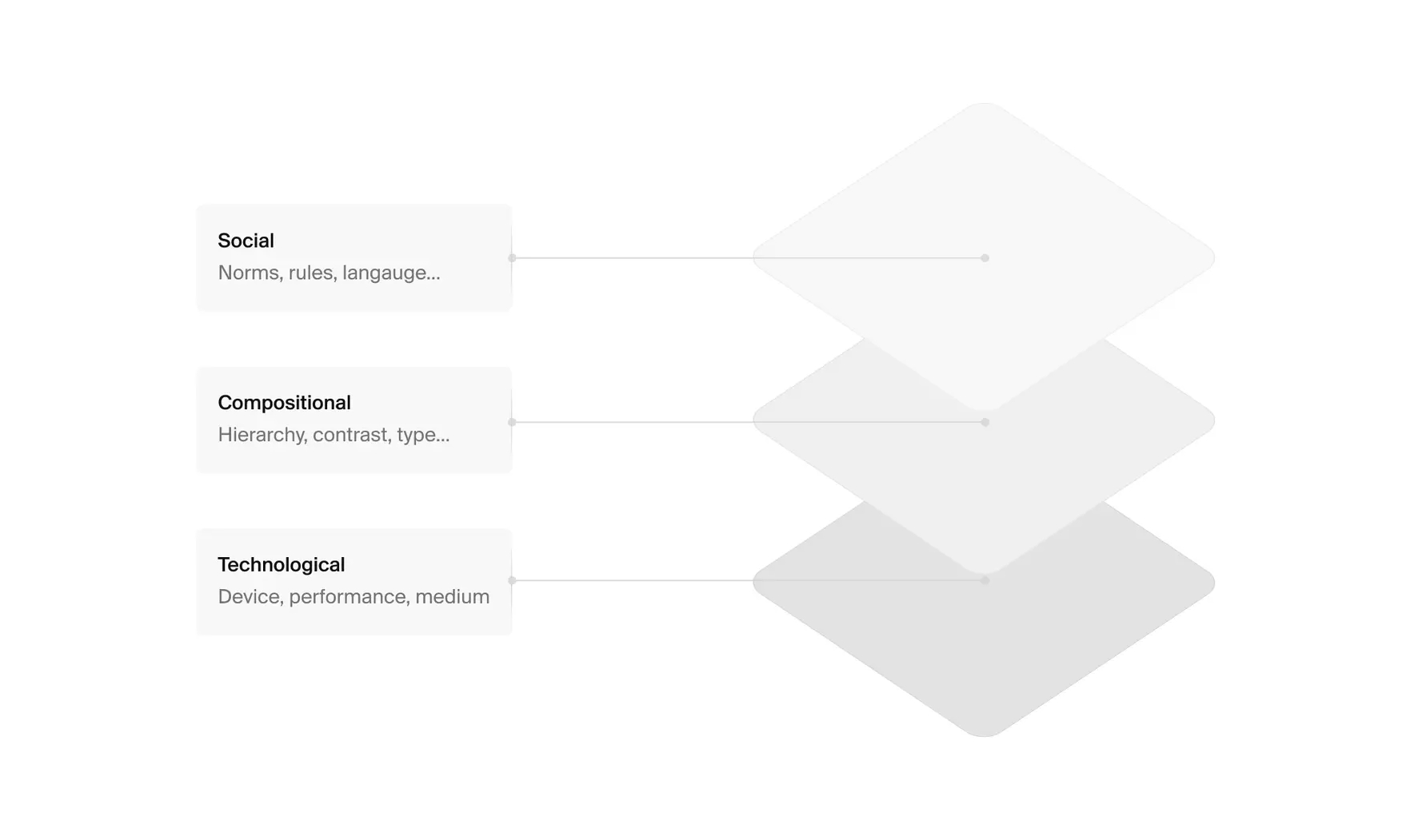
Most design feedback stares at pixels and ignores the moment a real person meets the screen.
The fix is a simple shift, treat every UI as meaning made in three places at once :
- 𝐖𝐡𝐞𝐧 𝐢𝐭’𝐬 𝐩𝐫𝐨𝐝𝐮𝐜𝐞𝐝
- 𝐈𝐧 𝐭𝐡𝐞 𝐝𝐞𝐬𝐢𝐠𝐧 𝐢𝐭𝐬𝐞𝐥𝐟
- 𝐈𝐧 𝐜𝐨𝐧𝐭𝐞𝐱𝐭
And look at each place through three lenses:
- 𝐓𝐞𝐜𝐡𝐧𝐨𝐥𝐨𝐠𝐢𝐜𝐚𝐥 (𝐝𝐞𝐯𝐢𝐜𝐞, 𝐩𝐞𝐫𝐟𝐨𝐫𝐦𝐚𝐧𝐜𝐞, 𝐦𝐞𝐝𝐢𝐮𝐦)
- 𝐂𝐨𝐦𝐩𝐨𝐬𝐢𝐭𝐢𝐨𝐧𝐚𝐥 (𝐡𝐢𝐞𝐫𝐚𝐫𝐜𝐡𝐲, 𝐜𝐨𝐧𝐭𝐫𝐚𝐬𝐭, 𝐭𝐲𝐩𝐞..)
- 𝐒𝐨𝐜𝐢𝐚𝐥 (𝐧𝐨𝐫𝐦𝐬, 𝐫𝐮𝐥𝐞𝐬, 𝐥𝐚𝐧𝐠𝐮𝐚𝐠𝐞).
That’s the “three sites × three modalities” idea: a small mental model that forces you to design for reality, not just for the canvas.
Example ? got you..
Picture someone adding an expense on a crowded tram with a low-end Android at noon... sunlight crushes contrast, one hand grips the pole, and they’ve got 20 seconds before their stop.
Start there (context): the device, light, grip, stress.
Then look at the image: does the first read land on “Amount,” are tap targets in the thumb zone, does the copy lower anxiety, does anything on the screen actually cause action?
Finally, own production: the real constraints you accepted (offline-first, perf budget), and the fake ones you can drop (unnecessary motion, extra steps).
This sequence isn’t aesthetic theory, it’s how meaning is made when a screen meets a person in a place. designs aren’t neutral; they interpret the world, and setting changes what they mean, so you judge a screen by what it does in that setting, not how polished it looks in Figma.
This framing comes from visual studies, which maps meaning across those three sites and three lenses.
In product work it becomes a practical habit: write one line before you shipl where will this be used, what’s the first read, what does it do in numbers, and refuse to call it “done” until all three are clear.
It keeps the team honest, because it anchors critique in context, artifact, and constraints instead of taste. Run that line against any screen tomorrow and you’ll feel the difference: the design starts serving the moment it lives in, not the mockup.